6/12/2026
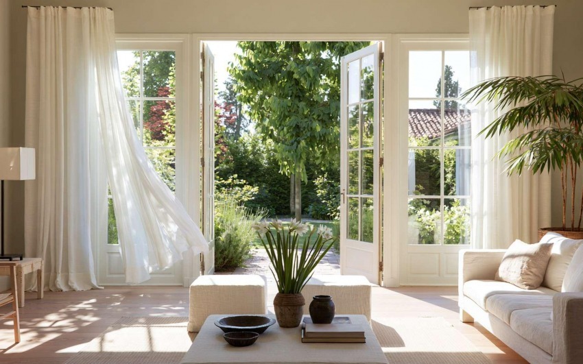
White is not neutral
There are hundreds of whites, and each one changes a room differently. Choosing "white" without specifying is already the wrong choice.
Cool white reflects northern blue light and makes rooms feel clinical on grey days. Warm white absorbs afternoon gold and gives it back as warmth. Off-white or greige lowers the contrast between surfaces and makes them feel closer together. None of these is neutral: all of them shift the perception of space. The problem is they get chosen as if they were interchangeable, because no one looks at them long enough in the room's actual light.
The practical rule: sample the colour on at least 30x30 cm, leave it on the wall for three days, observe it at different times of day. Only then decide.
Colour as a volume decision
A dark ceiling lowers. A dark back wall brings it closer. A dark side wall narrows. Colour is geometry.
Before choosing a colour for its aesthetic value, it's worth asking what it does to the room's volume. A deep green on all four walls of a tall sitting room doesn't make it gloomy: it makes it gathered, intimate, readable as a choice. The same green on low walls can turn a welcoming space into a suffocating box. The difference isn't the colour — it's the proportions.
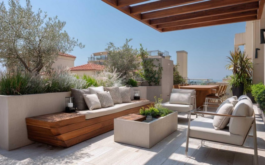
Similarly, painting only the back wall in a saturated colour is one of the most effective ways to give a room identity without touching its volume. The wall behind the sofa, behind the bed, the one you see when you open the door: these are the surfaces that "make" a room in the minds of the people who live there.
_adcfae08fc_.jpg)
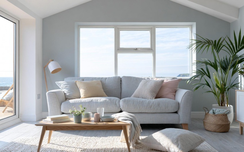
Tone on tone: the palette that doesn't tire
Three tones of the same colour hold better over time than three different colours well matched.
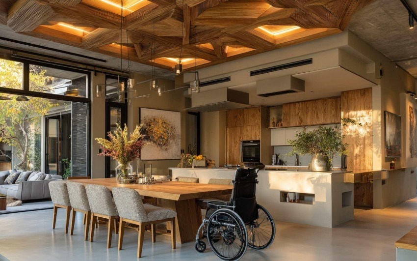
A tone-on-tone palette — main wall, accent wall, textiles and objects in variations of the same colour family — ages better because it doesn't depend on contrasts that can start to look dated. A room built entirely in earthy tones, from ivory to chocolate, reads well in twenty years. A bold blue-orange combination doesn't.
The risk of tone on tone is flatness, avoided by working on texture: matte surface, brushed surface, woven fabric, grained wood. The colour is the same, but light returns it differently on each material — and that difference is enough.
_9287e7c7fa_.jpg)
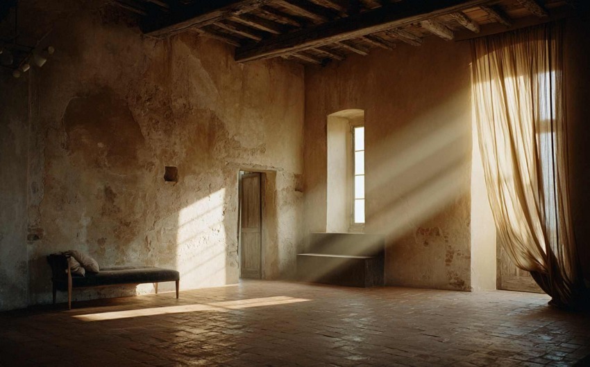
When to step back from colour
Sometimes the braver choice is to subtract, not add.
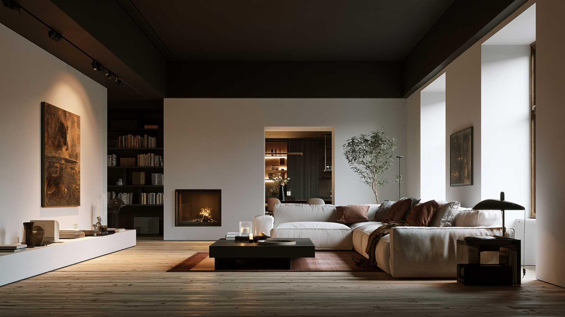
In spaces with poor natural light, low ceilings, or views onto dark walls and courtyards, saturated colour risks amplifying the problems rather than hiding them. In these cases, working on surface texture — lime plaster, textured wallpaper, raw terracotta — restores warmth and character without burdening perceived brightness.
Stepping back from colour doesn't mean giving up on identity. A room calibrated on whites, warm greys and pale wood can have more personality than one where every wall is a different colour. A space's character isn't given by colour: it's given by coherence.
_84c3b50416_.jpg)
In a showroom, colour always appears under ideal conditions — studied lighting, small samples, curated combinations. At home it appears under real ones. The IDW project considers both: not just how it looks, but how it looks in your home, with your light, at your hours.
Further reading
On the IDW blog: Decorating with colour: ideas for creating vibrant and stimulating spaces — how to use colour consciously to transform the atmosphere of every room.
Partner: Novamobili — modular Italian-design furniture systems with an extensive range of finishes and colours: fully customisable solutions for living, sleeping and day zones.
_14077b47db_23.jpg)
Interior Designer since 1985
CEO & Founder, Italian Design in the World