Beautiful for Everyone: Accessibility, Age and Design That Doesn't Look "Clinical"

4/10/2026

The ghost of the industrial rail

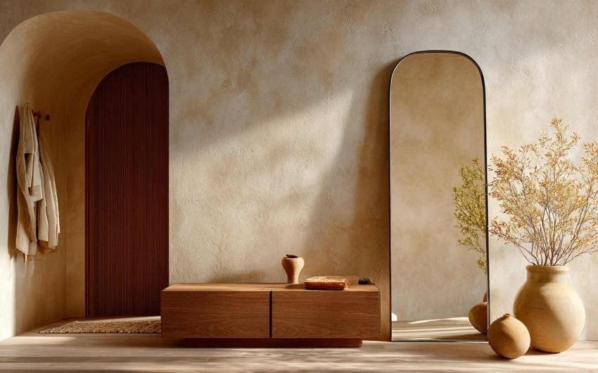
The prejudice comes from years of institutional rooms where function crushed aesthetics. In residential work, things have changed: handles that are objects, walk-in showers that are elegance before aid, wide doors and near-invisible thresholds that are build quality before regulation. The gap is not budget: it is awareness that dignity lives in daily details — the ones you touch hundreds of times a year.

This is not "designing for when we are old". It is not having to redo in ten years what you choose today for shape or trend. Foresight on heights, paths, colour contrast for reading steps and edges is investment in clarity, not only safety.


Bello-per-Tutti-Accessibilita-Eta-e-Design_IDW-Italia-Biella


Inclusive is not a synonym for "elderly"

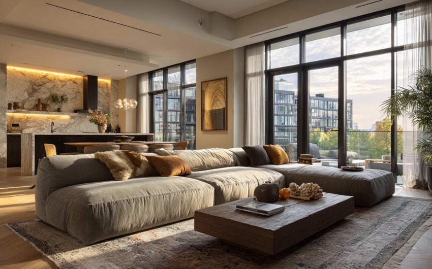
A home that welcomes different life phases — a child growing, a parent staying a few months, a temporary injury, not wanting to raise fixtures and swap handles in twenty years — is a less fragile home over time. The best design weaves these needs in without labelling them: solutions become part of the room's character, not add-ons.

Bello-per-Tutti-Accessibilita-Eta-e-Design_IDW-Italia-Biella


Four ideas that don't look like aids

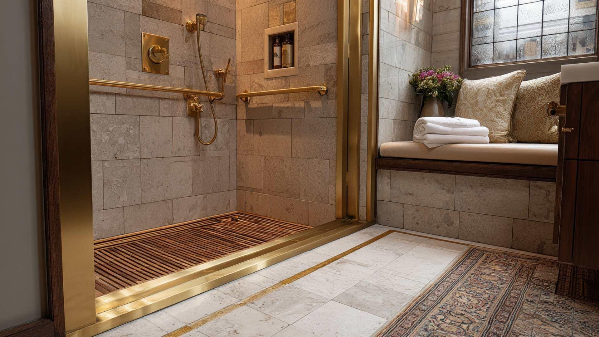
  • Clear paths: no invisible steps or rugs that "break" the stride; the floor tells you where to walk.
  • Visual contrast between surfaces and edges — not decoration, but reading steps, thresholds, level changes without hesitation.
  • Layered light — natural where possible, artificial when tuned — that models volume instead of glare and harsh shadow.
  • Furniture and handles chosen for real use: heights, depths, easy forms; armchairs that need not look "medical" to be supportive.

Serious brands integrate these into a coherent aesthetic: beauty and function stop competing when the project thinks beyond the rendering and thinks about the hands that will use the space.


Bello-per-Tutti-Accessibilita-Eta-e-Design_IDW-Italia-Biella

Bello-per-Tutti-Accessibilita-Eta-e-Design_IDW-Italia-Biella


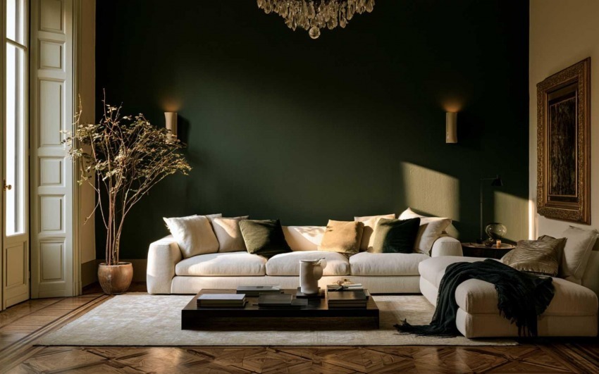
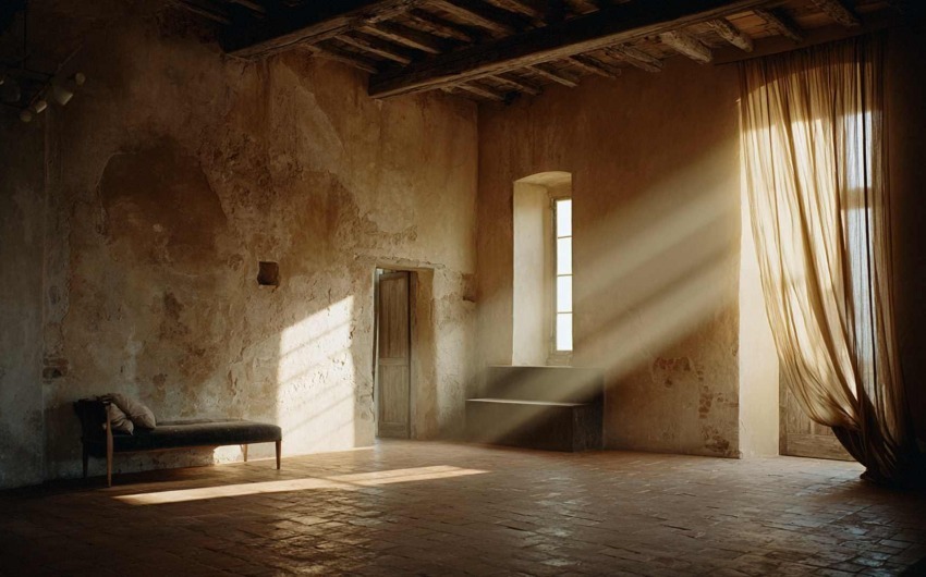
Contrast, light, matter: where dignity sits

Overly glossy surfaces, confused reflections, monochrome corridors can trap perception even for fully mobile people. Alternating tone and texture helps orientation; light is not only mood but visual comfort and safety. Interior design owes the proof that a "home for everyone" is not a neutral or sad home: it is clearer, more legible, more durable — and often, for that very reason, more beautiful.


Bello-per-Tutti-Accessibilita-Eta-e-Design_IDW-Italia-Biella


Cristiano Castaldi IDW Italia
Cristiano Castaldi

Interior Designer since 1985

CEO & Founder, Italian Design in the World

Related Articles

  • Between One Room and Another: Vestibules, Corridors and the Rhythm of the Home
    4/03/2026 Between One Room and Another: Vestibules, Corridors and the Rhythm of the Home

    Open a catalogue of contemporary homes and you often find cover-worthy kitchens, theatrical bathrooms, living rooms that look like photo sets. Between one image and the next, a narrow corridor appears, lit by a sad single point — or a vestibule reduced to a knot between doors. That is not a technical detail: it is silent design about what life spends most of its time doing — passing through, pausing, shifting register, leaving one room before entering another.

  • A Room for Everything: Dedicated Spaces (Beyond Open Plan)
    3/27/2026 A Room for Everything: Dedicated Spaces (Beyond Open Plan)

    Open plan has dominated the image of the contemporary home: few walls, few boundaries, maximum flexibility. The promise was freedom — kitchen in dialogue with the living room, light flowing, no "closed" rooms. Over time many have discovered the downside: noise travelling, no refuge, difficulty concentrating or switching off. The response isn't to go back to the closed-off house of the past, but to rethink the value of dedicated spaces: environments with a clear function that the body and mind learn to recognise.

  • The Sound of the House: Acoustics, Silence and Absorbing Materials
    3/13/2026 The Sound of the House: Acoustics, Silence and Absorbing Materials

    Interior design has long favoured sight: colours, shapes, surfaces. Only recently have we started to talk about touch and smell. Hearing, by contrast, remains the most neglected sense at the design stage — yet it's the one we can't switch off. We live in homes that boom, reverberate, carry voices and noise from one room to another. The result is stress, fatigue, difficulty concentrating and resting.

  • The House That Breathes: Seasonality and Natural Rhythms in Interiors
    3/06/2026 The House That Breathes: Seasonality and Natural Rhythms in Interiors

    For decades interior design has chased the idea of a "perfect", unchanging space: same colours, same lights, same layout twelve months a year. The home as a photo set always ready, but often distant from the cycles that govern our body and our mood.Today a different idea is returning: the house as an organism that responds to the seasons. Not an aesthetic whim, but a response to the need to align the environments we live in with natural rhythms — light, temperature, colour, vegetation — with measurable benefits for sleep, concentration and wellbeing.March, with the equinox and the awakening of spring, is the ideal time to rethink interiors in a seasonal key.

  • Honest Materials: The Aesthetics of Truth (and the End of “Fake Luxury”)
    2/27/2026 Honest Materials: The Aesthetics of Truth (and the End of “Fake Luxury”)

    For years, interior design has lived with a contradiction: an obsession with effect.
Marble-effect. Wood-effect. Metal-effect. Stone-effect.
A home that looks like something, rather than truly being something.

  • The Anti-Algorithm Home: Spaces That Aren’t Instagrammable (But Truly Livable)
    2/13/2026 The Anti-Algorithm Home: Spaces That Aren’t Instagrammable (But Truly Livable)

    For years, we designed homes as if they had to pass a constant visual exam: perfect light, perfect white, the right chair, the right vase. Interiors built to be photographed more than lived in.
Digital aesthetics — polished, minimal, hyper-ordered — entered interior design like an unspoken rule: if it isn’t “clean,” it isn’t beautiful; if it isn’t coherent, it isn’t successful; if it can’t be shown, it isn’t desirable.In 2026, this narrative is losing its power. Not because beauty matters less, but because beauty alone is no longer enough.
A new need is emerging: anti-algorithm interiors, spaces not designed for the shot, but for everyday life. Less performative homes, more real ones. Environments that don’t seek approval — they restore energy.This is not a return to chaos. It’s a return to meaning.