Warm Colors for Winter: How to Choose the Right Tones for Your Home

12/27/2024

Earth Tones for Natural Warmth


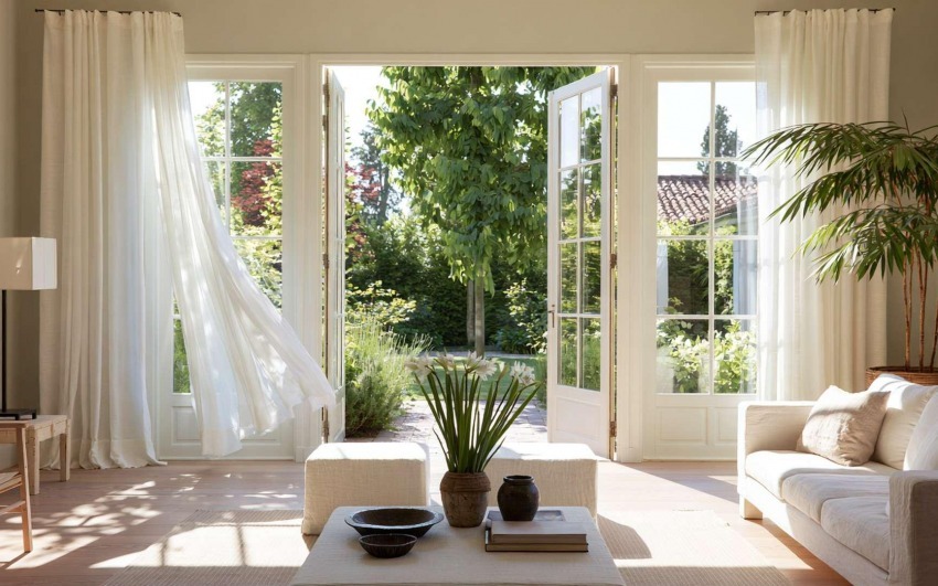
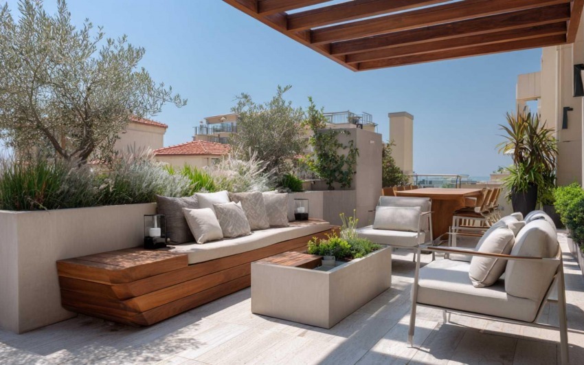
Beige, brown, terracotta, and ochre are colors that evoke nature and convey a sense of calm and serenity. Use them for walls, furniture, or textiles like curtains and blankets.


warm_tones_IDW-Italia-Prague-Biella


Accent Colors to Add Energy


Add a touch of vibrancy with accents of burgundy, olive green, or mustard yellow. These colors can be used for cushions, rugs, or decorative accessories, creating contrast without overwhelming the space.


warm_tones_IDW-Italia-Prague-Biella


Materials that Enhance the Colors


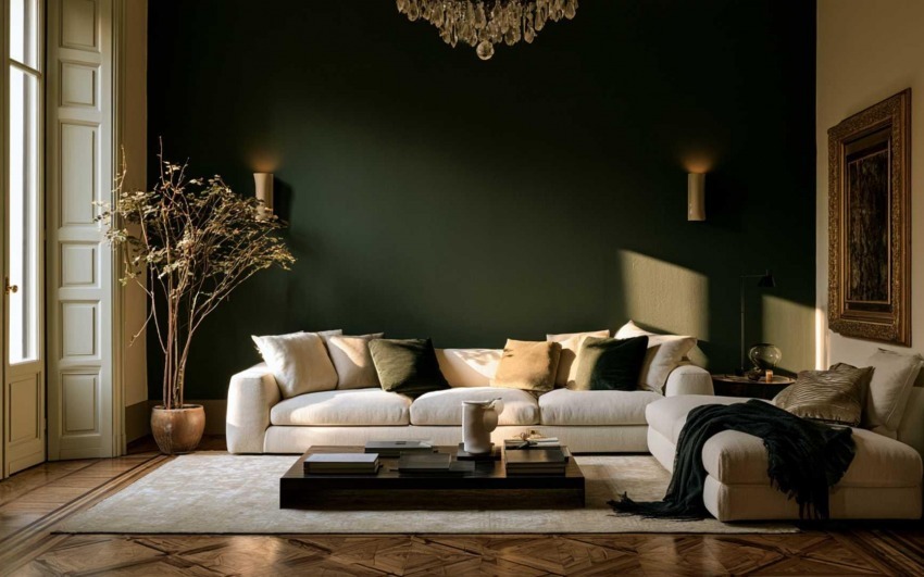
Choose soft and cozy fabrics like velvet, wool, and cotton. These materials not only improve comfort but also enhance warm colors, making the environment even cozier.


warm_tones_IDW-Italia-Prague-Biella


Lighting to Highlight Colors


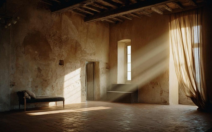
Use warm lights to emphasize the warm tones in your palette. Lamps with golden or amber hues can enhance the sense of intimacy and warmth.


warm_tones_IDW-Italia-Prague-Biella


Personalized Details


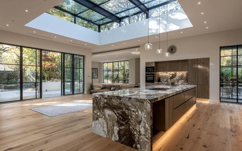
Paint one wall in a warm color to create a focal point or use artwork and prints with autumnal tones. Details make all the difference.


warm_tones_IDW-Italia-Prague-Biella


Cristiano Castaldi IDW Italia
Cristiano Castaldi

Interior Designer since 1985

CEO & Founder, Italian Design in the World

Related Articles

  • Water, Flows and Rituals: Kitchen and Bathroom Where Design Is Really Tested
    4/24/2026 Water, Flows and Rituals: Kitchen and Bathroom Where Design Is Really Tested

    Kitchen and bathroom are where the home meets water every day — preparation, cleaning, care, rest. That is why they are also where the gap between beautiful in rendering and sustainable in use shows first: droplets at joints, twisted paths, light that lies about the face, surfaces that demand obsessive cleaning.

  • Micro-Outdoor: Balcony, Loggia and Terrace as a Room (Even a Small One)
    4/17/2026 Micro-Outdoor: Balcony, Loggia and Terrace as a Room (Even a Small One)

    In the city, those few square metres beyond the door are often the only truce between the flat and the noise outside. They are not a decorative extra: they are a border — different light, different wind, different rules. Yet too many balconies stay storage for crates, folding chairs and rushed tiles, as if design stopped at the glass.

  • Beautiful for Everyone: Accessibility, Age and Design That Doesn't Look
    4/10/2026 Beautiful for Everyone: Accessibility, Age and Design That Doesn't Look "Clinical"

    The prejudice comes from years of institutional rooms where function crushed aesthetics. In residential work, things have changed: handles that are objects, walk-in showers that are elegance before aid, wide doors and near-invisible thresholds that are build quality before regulation. The gap is not budget: it is awareness that dignity lives in daily details — the ones you touch hundreds of times a year.

  • Between One Room and Another: Vestibules, Corridors and the Rhythm of the Home
    4/03/2026 Between One Room and Another: Vestibules, Corridors and the Rhythm of the Home

    Open a catalogue of contemporary homes and you often find cover-worthy kitchens, theatrical bathrooms, living rooms that look like photo sets. Between one image and the next, a narrow corridor appears, lit by a sad single point — or a vestibule reduced to a knot between doors. That is not a technical detail: it is silent design about what life spends most of its time doing — passing through, pausing, shifting register, leaving one room before entering another.

  • A Room for Everything: Dedicated Spaces (Beyond Open Plan)
    3/27/2026 A Room for Everything: Dedicated Spaces (Beyond Open Plan)

    Open plan has dominated the image of the contemporary home: few walls, few boundaries, maximum flexibility. The promise was freedom — kitchen in dialogue with the living room, light flowing, no "closed" rooms. Over time many have discovered the downside: noise travelling, no refuge, difficulty concentrating or switching off. The response isn't to go back to the closed-off house of the past, but to rethink the value of dedicated spaces: environments with a clear function that the body and mind learn to recognise.

  • The Sound of the House: Acoustics, Silence and Absorbing Materials
    3/13/2026 The Sound of the House: Acoustics, Silence and Absorbing Materials

    Interior design has long favoured sight: colours, shapes, surfaces. Only recently have we started to talk about touch and smell. Hearing, by contrast, remains the most neglected sense at the design stage — yet it's the one we can't switch off. We live in homes that boom, reverberate, carry voices and noise from one room to another. The result is stress, fatigue, difficulty concentrating and resting.