The Design of Intuition: Why Some Spaces Instantly Feel "Right"

4/03/2025

1. Unconscious Spatial Perception: How Our Brain Analyzes Interiors

Our brain is wired to instinctively analyze spaces, evaluating proportions, colors, and layout without us even realizing it. This process is based on key principles such as:

Order and visual clarity: Spaces with a clear and logical arrangement feel more intuitive and relaxing. A cluttered environment with too many scattered elements creates visual stress.

Harmonic proportions: Our brain responds positively to certain proportions, such as the golden ratio or the rule of thirds, which are also found in art and nature.

Natural movement pathways: Rooms where it is easy to move around, without obstacles and with well-defined pathways, feel more welcoming.

Practical Example: A dining room with a large solid wood table. If the space around the table is overcrowded with chairs, vases, lamps, and decorations, the table itself loses its presence. However, if more space is left around it, the table becomes more visually striking and scenographic.


the-design-of-intuition_IDW-Italia-Prague-Biella


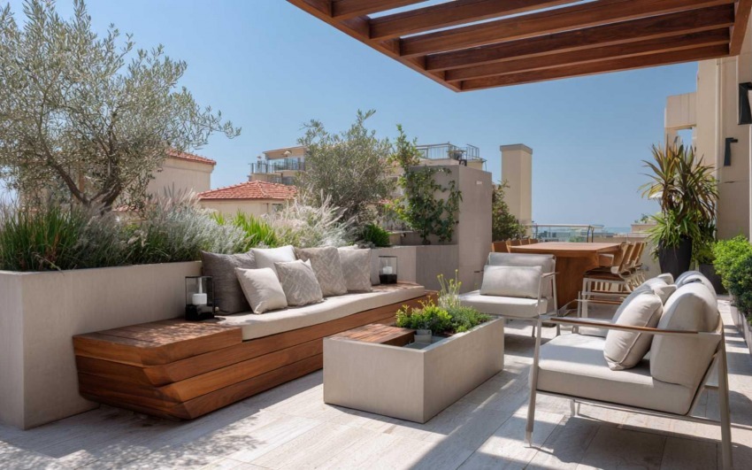
2. The Role of Symmetry and Asymmetry in Intuitive Design

Our brain naturally prefers symmetry because it associates it with order and balance. However, a completely symmetrical environment can feel static and lacking personality.

Symmetry: Perfect for formal and relaxing settings, like bedrooms with identical nightstands on either side of the bed.

Balanced asymmetry: Creates a sense of dynamism without feeling messy. This is achieved by distributing elements in a harmonious yet non-rigid way.

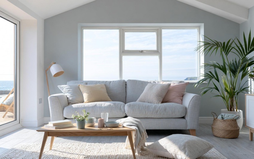
Practical Example: In a living room, a sofa with a floor lamp on one side and a small table with a plant on the other creates balanced asymmetry, which feels more natural and welcoming.


the-design-of-intuition IDW-Italia-Prague-Biella


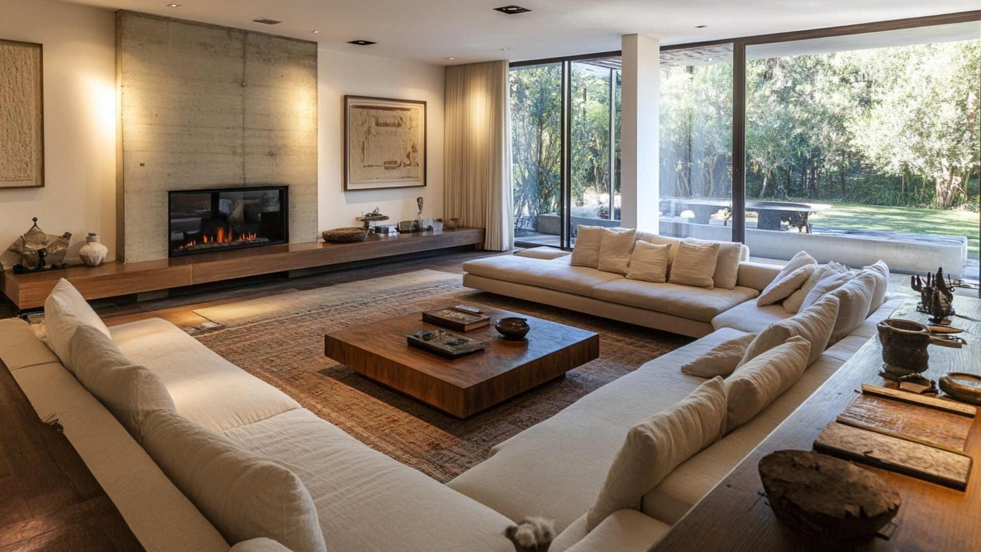
3. The Influence of Color on Spatial Perception

Color has a direct impact on our emotions and the way we perceive space. Some intuitive design principles related to color include:

Light and neutral tones to make a space feel more open and airy.

Dark and rich tones to create depth and a sense of intimacy.

Moderate contrast to avoid excessive visual stimulation.

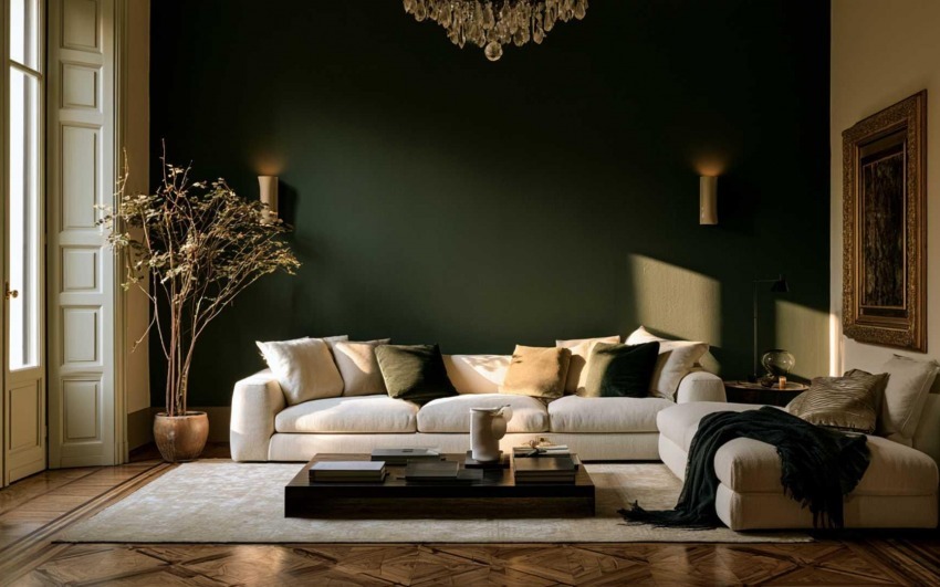
Practical Example: A sage green wall in a living room with neutral furniture creates a calming effect without overwhelming the environment.


the-design-of-intuition_IDW-Italia-Prague-Biella


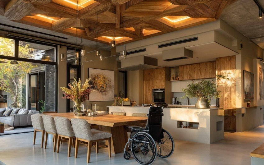
4. The Importance of Visual Hierarchy and Focal Points

A good intuitive design naturally guides the eye towards the most important elements of a room. A focal point helps organize the space and prevents furniture from being arranged randomly.

Examples of focal points: A large artwork above a sofa, a stylish bookshelf, or a panoramic window.

Furniture arrangement: Pieces should be placed in a way that enhances the focal point rather than competing with it.

Practical Example: In a dining room, an elegant chandelier above the table acts as the main focal point, helping to organize the rest of the furniture around it.


the-design-of-intuition_IDW-Italia-Prague-Biella


Intuitive design is what makes a space feel immediately pleasant and harmonious, without the need for rational analysis. Understanding the principles of visual perception, proportions, colors, and focal points allows us to create interiors that are both inviting and functional.

When a space “feels right” at first glance, it’s because it has been designed following principles that our brain unconsciously recognizes. Integrating these concepts into home design enhances not only aesthetics but also the daily well-being of those who live in the space.


Cristiano Castaldi IDW Italia
Cristiano Castaldi

Interior Designer since 1985

CEO & Founder, Italian Design in the World

Related Articles

  • Between One Room and Another: Vestibules, Corridors and the Rhythm of the Home
    4/03/2026 Between One Room and Another: Vestibules, Corridors and the Rhythm of the Home

    Open a catalogue of contemporary homes and you often find cover-worthy kitchens, theatrical bathrooms, living rooms that look like photo sets. Between one image and the next, a narrow corridor appears, lit by a sad single point — or a vestibule reduced to a knot between doors. That is not a technical detail: it is silent design about what life spends most of its time doing — passing through, pausing, shifting register, leaving one room before entering another.

  • A Room for Everything: Dedicated Spaces (Beyond Open Plan)
    3/27/2026 A Room for Everything: Dedicated Spaces (Beyond Open Plan)

    Open plan has dominated the image of the contemporary home: few walls, few boundaries, maximum flexibility. The promise was freedom — kitchen in dialogue with the living room, light flowing, no "closed" rooms. Over time many have discovered the downside: noise travelling, no refuge, difficulty concentrating or switching off. The response isn't to go back to the closed-off house of the past, but to rethink the value of dedicated spaces: environments with a clear function that the body and mind learn to recognise.

  • The Sound of the House: Acoustics, Silence and Absorbing Materials
    3/13/2026 The Sound of the House: Acoustics, Silence and Absorbing Materials

    Interior design has long favoured sight: colours, shapes, surfaces. Only recently have we started to talk about touch and smell. Hearing, by contrast, remains the most neglected sense at the design stage — yet it's the one we can't switch off. We live in homes that boom, reverberate, carry voices and noise from one room to another. The result is stress, fatigue, difficulty concentrating and resting.

  • The House That Breathes: Seasonality and Natural Rhythms in Interiors
    3/06/2026 The House That Breathes: Seasonality and Natural Rhythms in Interiors

    For decades interior design has chased the idea of a "perfect", unchanging space: same colours, same lights, same layout twelve months a year. The home as a photo set always ready, but often distant from the cycles that govern our body and our mood.Today a different idea is returning: the house as an organism that responds to the seasons. Not an aesthetic whim, but a response to the need to align the environments we live in with natural rhythms — light, temperature, colour, vegetation — with measurable benefits for sleep, concentration and wellbeing.March, with the equinox and the awakening of spring, is the ideal time to rethink interiors in a seasonal key.

  • Honest Materials: The Aesthetics of Truth (and the End of “Fake Luxury”)
    2/27/2026 Honest Materials: The Aesthetics of Truth (and the End of “Fake Luxury”)

    For years, interior design has lived with a contradiction: an obsession with effect.
Marble-effect. Wood-effect. Metal-effect. Stone-effect.
A home that looks like something, rather than truly being something.

  • The Anti-Algorithm Home: Spaces That Aren’t Instagrammable (But Truly Livable)
    2/13/2026 The Anti-Algorithm Home: Spaces That Aren’t Instagrammable (But Truly Livable)

    For years, we designed homes as if they had to pass a constant visual exam: perfect light, perfect white, the right chair, the right vase. Interiors built to be photographed more than lived in.
Digital aesthetics — polished, minimal, hyper-ordered — entered interior design like an unspoken rule: if it isn’t “clean,” it isn’t beautiful; if it isn’t coherent, it isn’t successful; if it can’t be shown, it isn’t desirable.In 2026, this narrative is losing its power. Not because beauty matters less, but because beauty alone is no longer enough.
A new need is emerging: anti-algorithm interiors, spaces not designed for the shot, but for everyday life. Less performative homes, more real ones. Environments that don’t seek approval — they restore energy.This is not a return to chaos. It’s a return to meaning.