The Beauty of Imperfection: Wabi-Sabi and the Art of Asymmetry in Design

3/21/2025

1. What is Wabi-Sabi?

The concept of Wabi-Sabi originates from Japanese culture and is based on three fundamental principles:

Wabi (侘): Simplicity, humility, and the beauty of modest things. A raw ceramic vase or an untreated wooden table are perfect examples.

Sabi (寂): The appreciation of time’s passage and the beauty of wear. An antique piece of furniture with visible signs of use carries an aesthetic value that tells a story.

Acceptance of imperfection: The core idea of Wabi-Sabi is that nothing is eternal, perfect, or complete—yet it is precisely this transience that makes things beautiful.


Practical Example

A wooden coffee table with visible knots and grain, perhaps with slight signs of aging, has an authentic charm that a perfectly lacquered and polished piece could never convey.


wabi-sabi_IDW-Italia-Prague-Biella


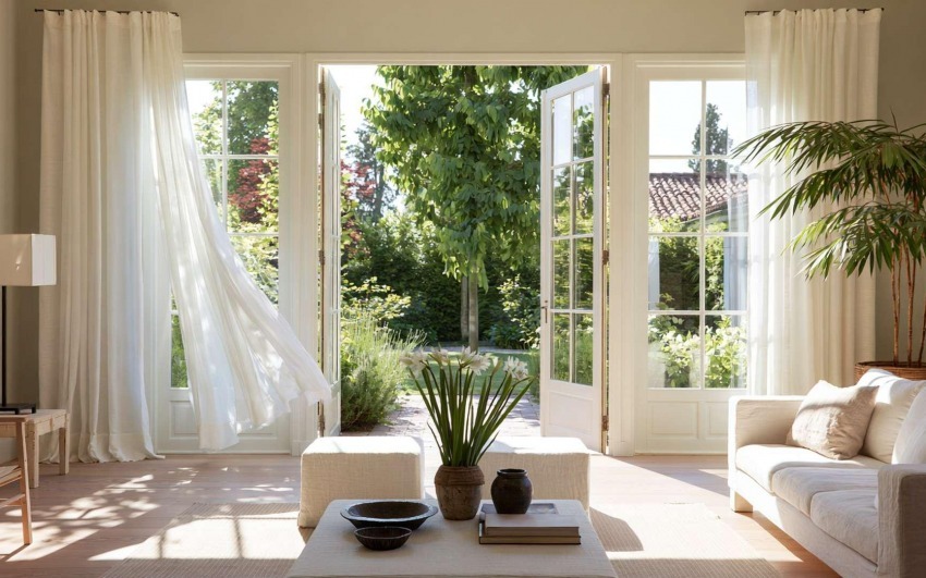
2. Asymmetry as a Design Choice

In Western design, symmetry is often associated with order and beauty, but Wabi-Sabi teaches us that asymmetry is more natural and interesting.

Avoid rigid layouts: A living room doesn’t need a perfectly centered sofa with two identical lamps on either side. A slightly off-center lighting arrangement or a mix of different seating options creates a more dynamic environment.

Mix different objects: A set of plates with slight variations in shape and color adds character to a dining table.

Let space breathe: Not every surface needs to be filled. A bare corner with a single sculpture or plant can be more impactful than a wall overloaded with decorations.


Practical Example

A bookshelf with irregularly spaced shelves and objects arranged in a non-symmetrical manner makes the space feel more spontaneous and natural.


wabi-sabi_IDW-Italia-Prague-Biella


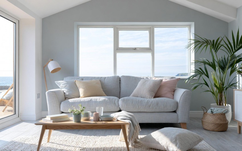
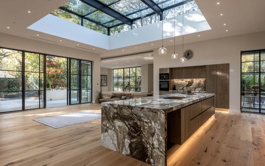
3. Natural Materials and Raw Textures

One of the fundamental principles of Wabi-Sabi is the use of authentic, untreated materials.

Raw wood: Tables and chairs with irregular surfaces and visible imperfections.

Handmade ceramics: Plates and vases with slight variations in shape and glazing.

Raw linen and cotton: Soft, unpressed fabrics with a natural texture.

Oxidized metals and raw stone: Wrought iron details or marble with strong veins.


Practical Example

A kitchen with a natural stone countertop, featuring irregular veins and imperfect edges, is far more inviting and interesting than a kitchen with synthetic, perfectly smooth surfaces.


wabi-sabi_IDW-Italia-Prague-Biella


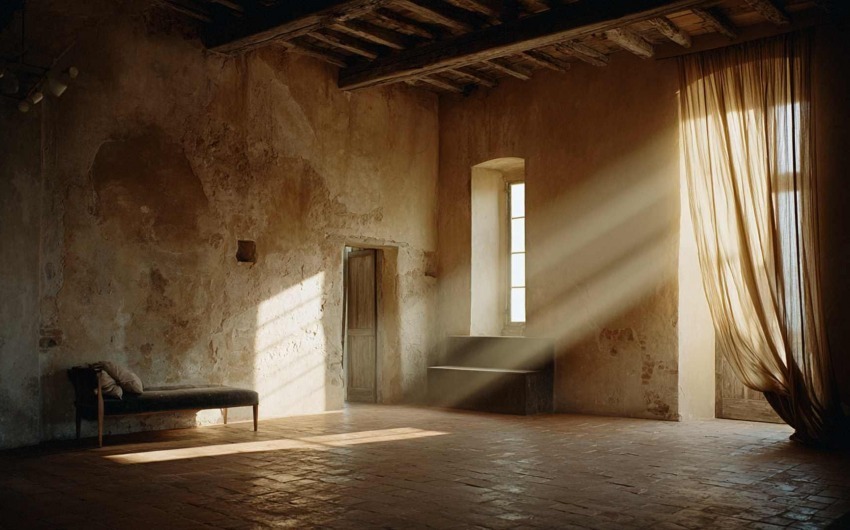
4. Time as an Aesthetic Element

Wabi-Sabi celebrates the effects of time on objects and spaces.

Don’t hide signs of use: A wooden floor with scratches and imperfections tells a story and adds character to a home.

Restore and repurpose: Instead of replacing old furniture, highlight its original beauty with a new finish or leave it as it is.

Use natural decorations: Moss, dried branches, or aged leaves bring an authentic and delicate charm to a space.


Practical Example

A family heirloom dining table with visible signs of age can become the focal point of a living room, making it unique and rich in meaning.


wabi-sabi_IDW-Italia-Prague-Biella


Wabi-Sabi is more than just a decorating style—it’s a philosophy that encourages us to slow down, appreciate simplicity, and embrace imperfection. Creating a space inspired by this aesthetic means abandoning the obsessive pursuit of perfection and choosing materials, objects, and furnishings that tell a story.

In your home, imperfection is not a flaw—it’s a value.


Cristiano Castaldi IDW Italia
Cristiano Castaldi

Interior Designer since 1985

CEO & Founder, Italian Design in the World

Related Articles

  • Water, Flows and Rituals: Kitchen and Bathroom Where Design Is Really Tested
    4/24/2026 Water, Flows and Rituals: Kitchen and Bathroom Where Design Is Really Tested

    Kitchen and bathroom are where the home meets water every day — preparation, cleaning, care, rest. That is why they are also where the gap between beautiful in rendering and sustainable in use shows first: droplets at joints, twisted paths, light that lies about the face, surfaces that demand obsessive cleaning.

  • Micro-Outdoor: Balcony, Loggia and Terrace as a Room (Even a Small One)
    4/17/2026 Micro-Outdoor: Balcony, Loggia and Terrace as a Room (Even a Small One)

    In the city, those few square metres beyond the door are often the only truce between the flat and the noise outside. They are not a decorative extra: they are a border — different light, different wind, different rules. Yet too many balconies stay storage for crates, folding chairs and rushed tiles, as if design stopped at the glass.

  • Beautiful for Everyone: Accessibility, Age and Design That Doesn't Look
    4/10/2026 Beautiful for Everyone: Accessibility, Age and Design That Doesn't Look "Clinical"

    The prejudice comes from years of institutional rooms where function crushed aesthetics. In residential work, things have changed: handles that are objects, walk-in showers that are elegance before aid, wide doors and near-invisible thresholds that are build quality before regulation. The gap is not budget: it is awareness that dignity lives in daily details — the ones you touch hundreds of times a year.

  • Between One Room and Another: Vestibules, Corridors and the Rhythm of the Home
    4/03/2026 Between One Room and Another: Vestibules, Corridors and the Rhythm of the Home

    Open a catalogue of contemporary homes and you often find cover-worthy kitchens, theatrical bathrooms, living rooms that look like photo sets. Between one image and the next, a narrow corridor appears, lit by a sad single point — or a vestibule reduced to a knot between doors. That is not a technical detail: it is silent design about what life spends most of its time doing — passing through, pausing, shifting register, leaving one room before entering another.

  • A Room for Everything: Dedicated Spaces (Beyond Open Plan)
    3/27/2026 A Room for Everything: Dedicated Spaces (Beyond Open Plan)

    Open plan has dominated the image of the contemporary home: few walls, few boundaries, maximum flexibility. The promise was freedom — kitchen in dialogue with the living room, light flowing, no "closed" rooms. Over time many have discovered the downside: noise travelling, no refuge, difficulty concentrating or switching off. The response isn't to go back to the closed-off house of the past, but to rethink the value of dedicated spaces: environments with a clear function that the body and mind learn to recognise.

  • The Sound of the House: Acoustics, Silence and Absorbing Materials
    3/13/2026 The Sound of the House: Acoustics, Silence and Absorbing Materials

    Interior design has long favoured sight: colours, shapes, surfaces. Only recently have we started to talk about touch and smell. Hearing, by contrast, remains the most neglected sense at the design stage — yet it's the one we can't switch off. We live in homes that boom, reverberate, carry voices and noise from one room to another. The result is stress, fatigue, difficulty concentrating and resting.