7/08/2022
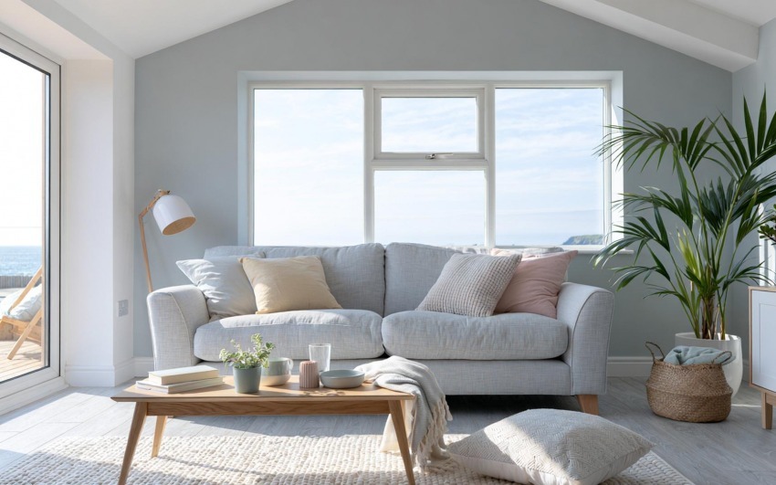
White is an excellent ally in home furnishings, both for its evergreen charm and for its functionality in terms of space and lighting.
In addition, total white furniture is often chosen because it can easily adapt to multiple styles, even if completely different from each other, such as classic, minimal, Nordic, modern and country.
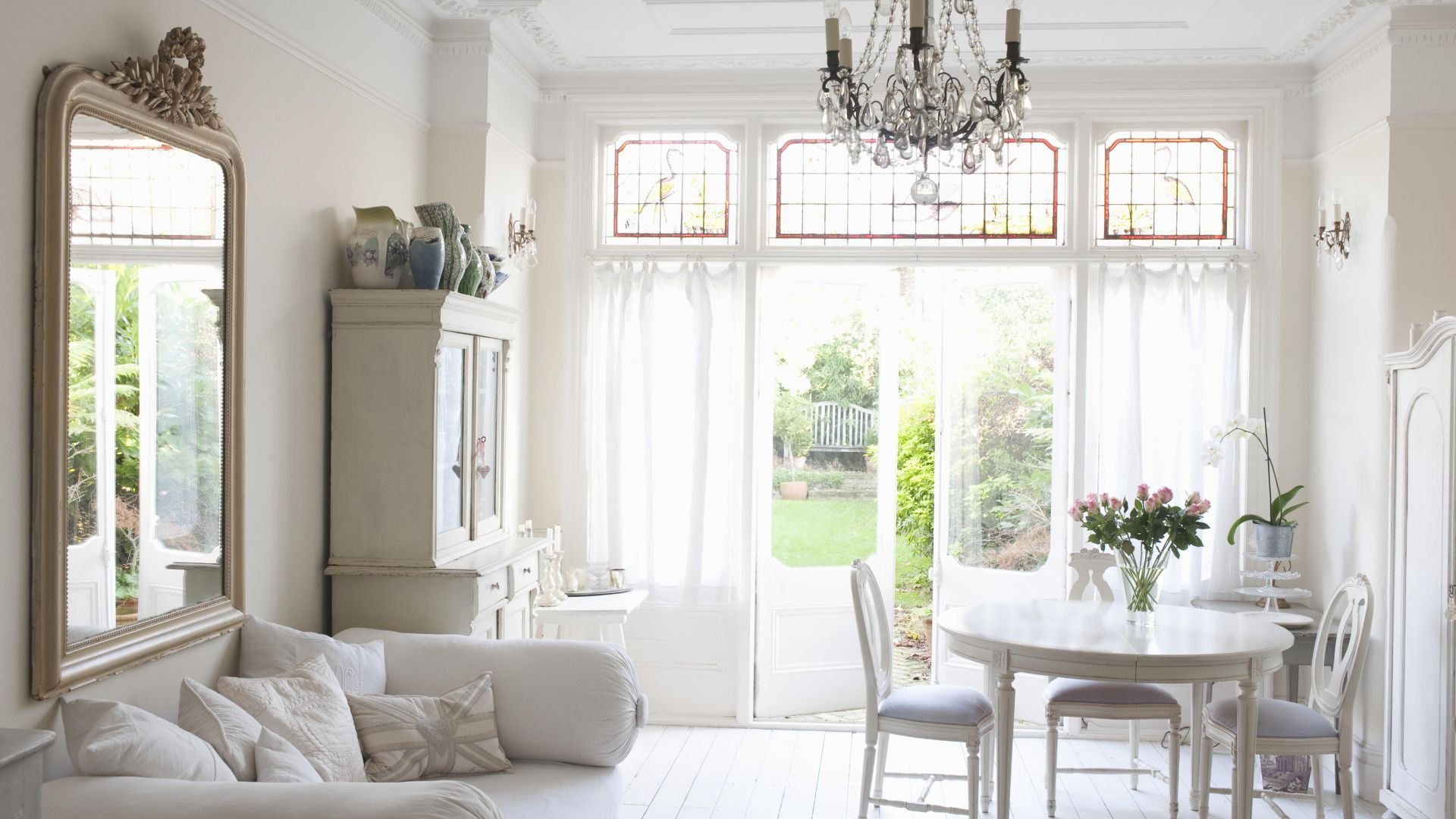
If on the one hand, counter furniture can give life to delicate and design environments, on the other hand, if not calibrated in the right way, it can lead to the creation of a boring, anonymous and unwelcoming environment. For this reason, if we decide to try our hand at creating a total white style furniture, it is very important to be able to play with the various shades of white, which is not at all easy given the variety: chalk white, Navajo, Fumo, Antico, “Dirty”, Ivory, zinc white, Milk and so on .. Depending on the choice of shades and the combination of colors, perhaps under the guidance of an expert, it will be possible to create the much desired style.
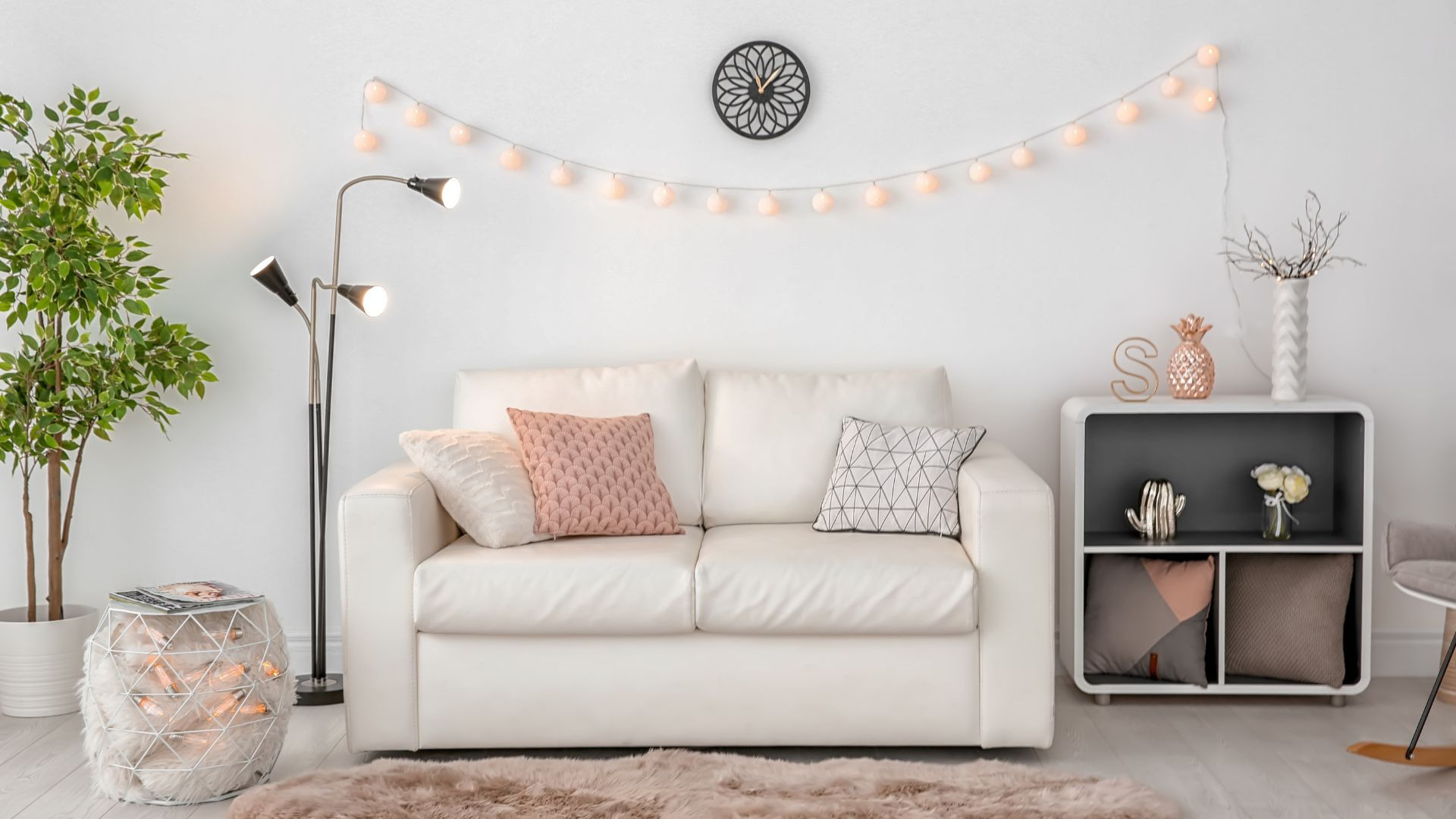
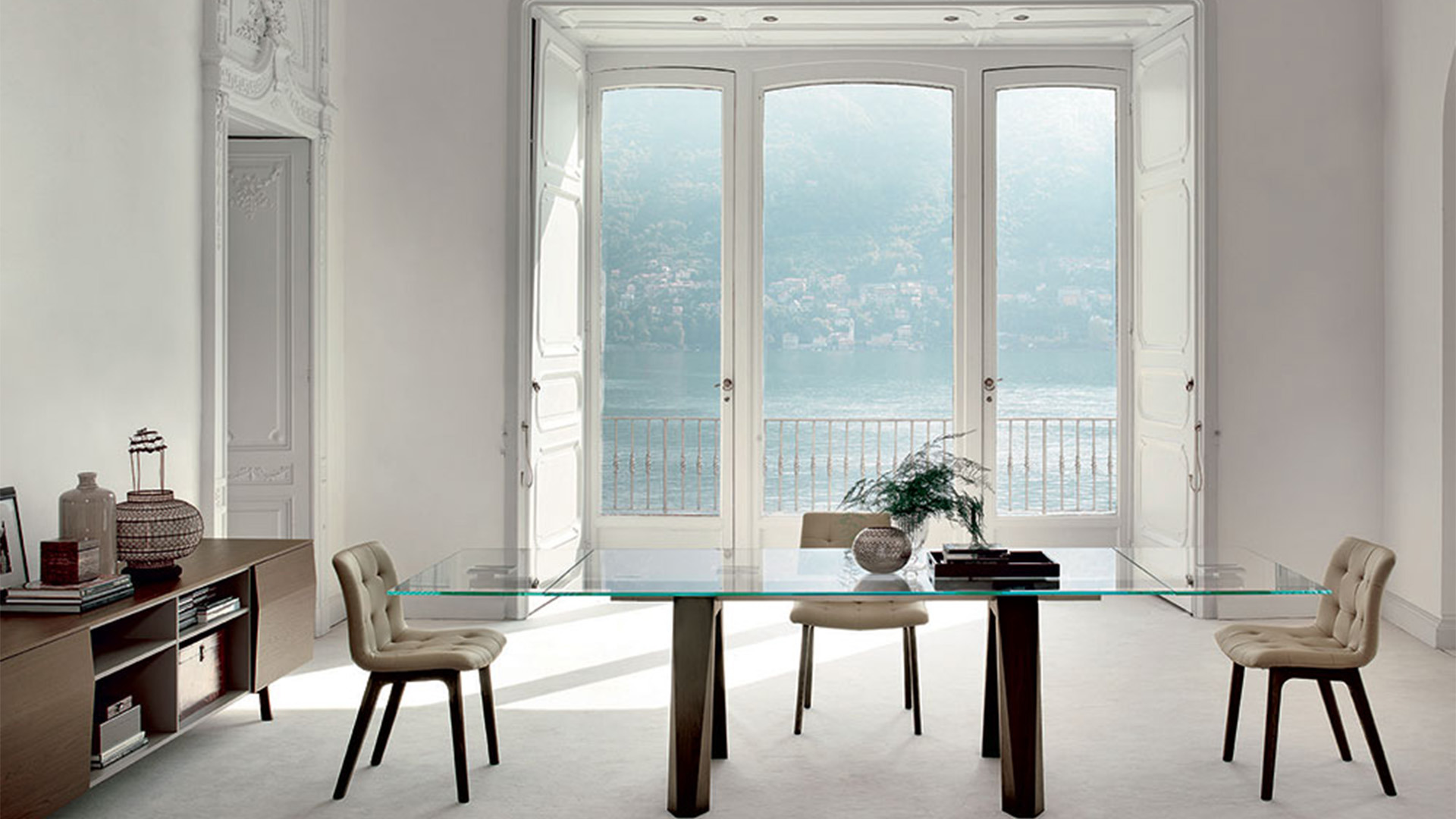
Let's get to the point, where can we start? Of course, the primary way to diffuse white and create a luminous effect is to start from the walls. Remember to pay attention, however, not to choose an excessively cold white, otherwise you could run into the much-hated "hospital effect", especially for the sleeping area.
This solution is adopted not only by total white, but also by other styles in order to be able to create a neutral base, taking advantage of natural light and allowing the details to stand out, such as, for example, the Scandinavian style.
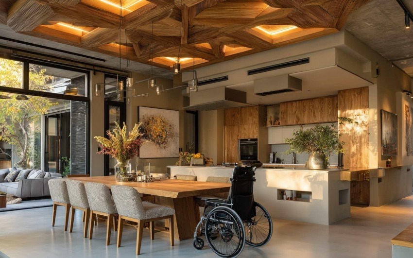
No less important are the floors: this style of interior design prefers light floors, no darker than a beige, a dove gray, a cream or a very very light gray. Of course, it would be better to avoid black tiles or dark wood parquet. A possible solution, in addition to the classic white tile, could be to opt for ash, chestnut or fir wood floors, which are characterized by a very light base, which allows us to combine different white furnishings, thus avoiding too strong contrasts. For example, we could combine this solution with a light wood ceiling, which gives our environment a look in perfect style!
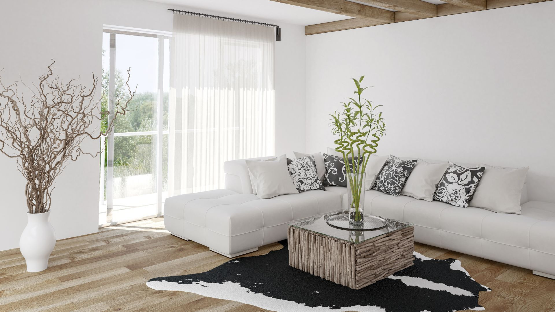
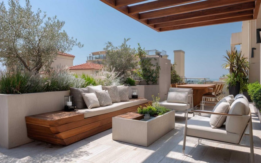
The total white style therefore does not allow us to play excessively with colors, but allows us to use another winning weapon, namely that of materials. For example, insert finishes and details in steel, wood, glass, gold and brass, or think of upholstery for armchairs and sofas in different materials, such as velvet, microfiber, cotton.
We advise you to pay particular attention to the management of the total white style, in the various rooms of the house, in order to avoid running into unpleasant mistakes: the most complex rooms to be furnished in this style are mainly the kitchen and living room, since they must also take into account of the lifestyle, habits and way in which the family lives. One of the most common mistakes is to first choose the fundamental elements and instead postpone the purchase of objects and accessories, without considering the environment as a whole. In this way you risk having perfect color combinations, but furniture that clash with each other due to the different styles or some furnishings that clash with the various accessories.
Finally, do not forget that lighting and natural light also play a fundamental role both in making the environment brighter and in bringing out the white, of the much loved total white style: the lighting project will have an incredible influence on the perception of the environments.
Our most dispassionate advice is therefore to indulge yourself, as much as possible, in every useful detail, in order to create our dream home in a total white style and to try in every way to avoid some wrong choices, which could break the much hoped-for charm, creating sterile, cold and totally devoid of personality environments!
_14077b47db_23.jpg)
Interior Designer since 1985
CEO & Founder, Italian Design in the World