3/05/2021
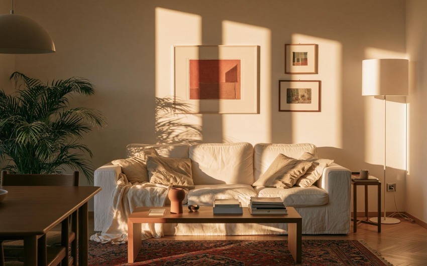
If you are looking for an elegant and refined living room, you will undoubtedly be thinking of buying elements and furniture in this colour, or why not paint the walls of your living room in cream. This colour is much appreciated because of its incredible versatility. It is perfect for creating delicate and cosy combinations, but it is also very suitable for more lively combinations that never lose their style.
Cream colours also owe their appeal to the simplicity with which they can be used to decorate homes of different styles, from minimal to contemporary, from country to Scandinavian.
If you wonder whether this is the perfect colour for your home, our suggestions and proposals will try to remove all doubt.
1. Minimal Home
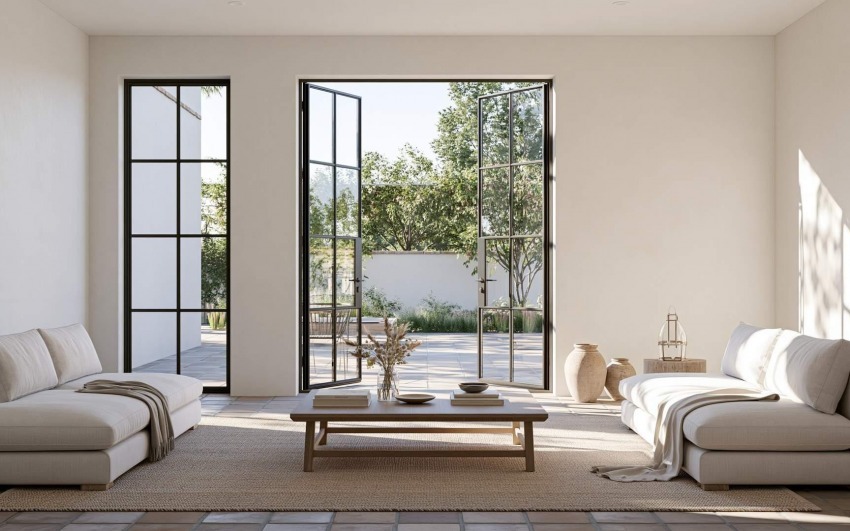
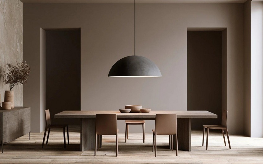
If you're looking to transform your flat into a minimalist design space, the lightness of a cream colour could help you highlight your most sophisticated furnishings and the essential lines of your décor.
Our advice is to add a few details of colour to give character to your space, to avoid a cold and unwelcoming environment.
2. Perfect for attics
These days, they are increasingly popular, but they are complicated to furnish as beautiful as they are. The most common mistake is the choice of colour: don't go for colours that are too dark, which can close off spaces, but instead prefer light colours that give space to every room.
This is how the choice of cream shades is perfect in an attic, especially for the walls.
3. Exciting combinations
If you aim to use colours and objects to fill the spaces in your home, the cream is an excellent background for highlighting them. The neutrality of this colour will not create an absolute dominance, and so you can have fun looking for different coloured objects and create unique combinations every day.
4. Space for fantasy, cream in industrial lofts
We usually think of beige as a classic, refined colour, perfect for the most elegant and classy spaces and trendy for more lively combinations. But the cream colour allows us to go outside the ordinary schemes and use it in the living areas of industrial-style lofts.
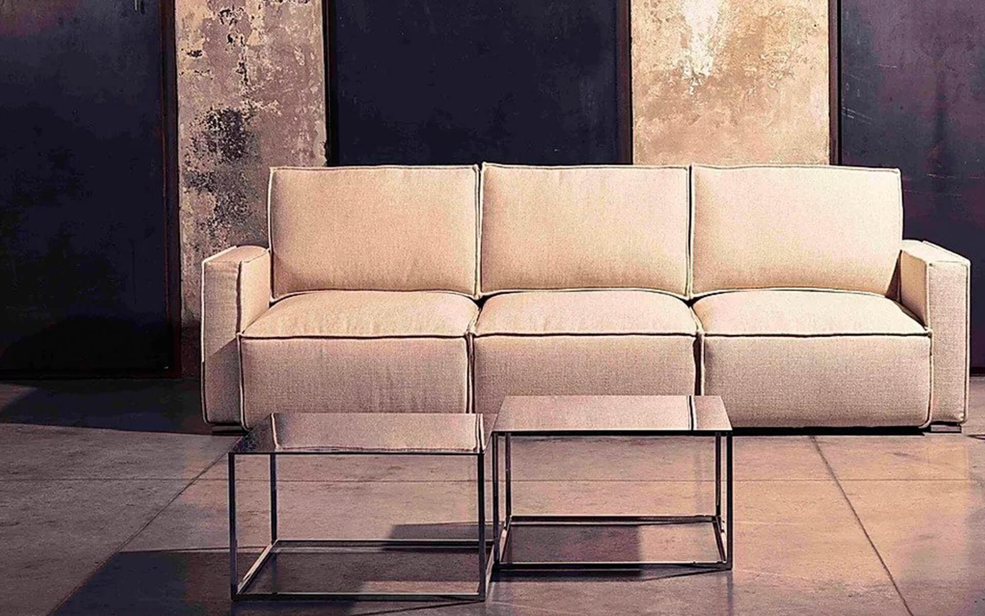
The sofa is the Manhattan model by Family Bedding.
5. Traditional living area
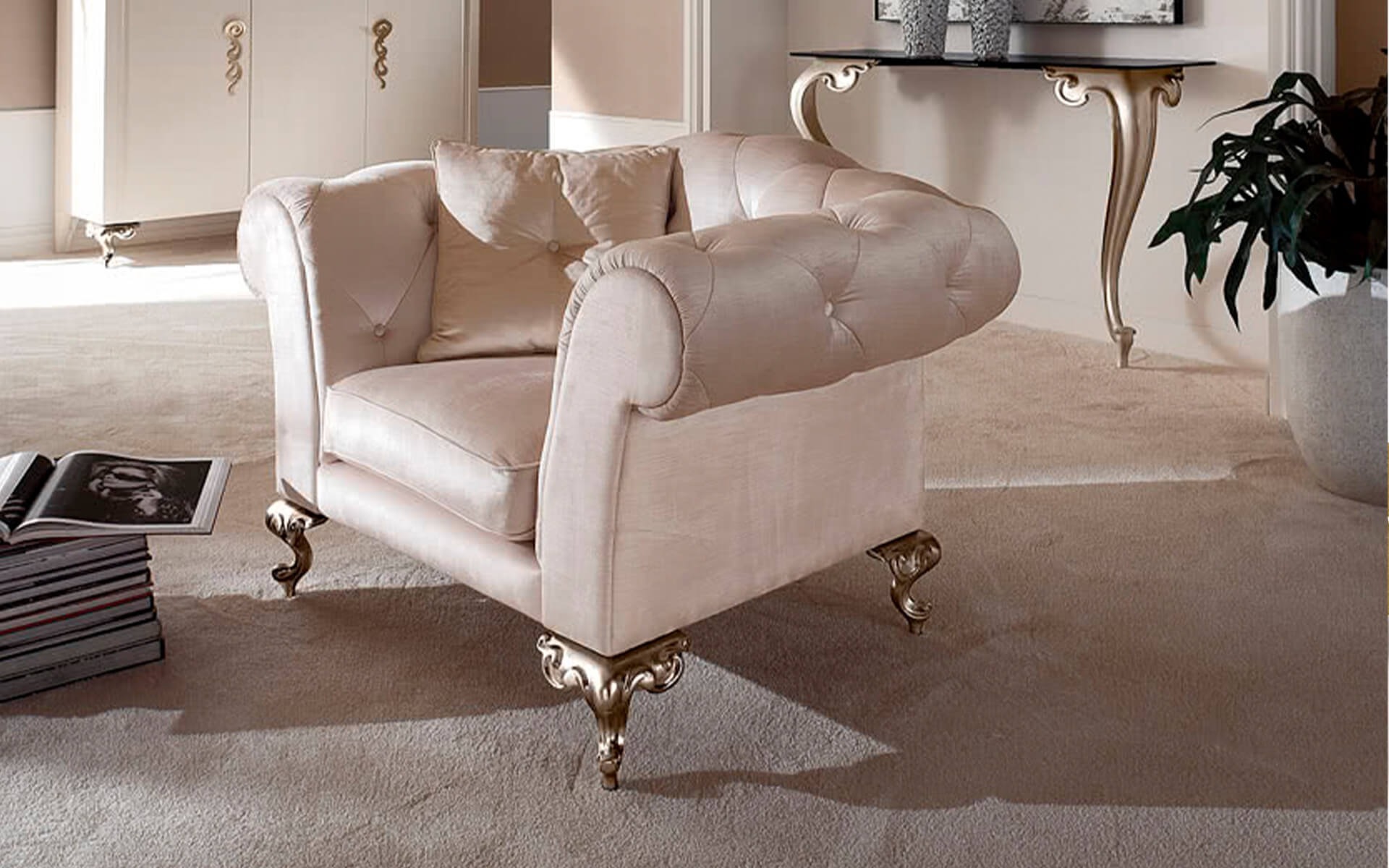
If you have a classic living area with lots of windows and light, the cream is an excellent alternative to white. Your room will be warmer and more welcoming.
Look, for example, at this beautiful Cantori armchair, its great shapes finding the right balance in this living area dominated by neutral colours.
6. Exploit natural light
This point ties in perfectly with the previous one. Taking advantage of natural light means choosing colours that can enhance it and use it to define spaces.
The cream is an excellent ally.
7. Combinations with blue and light blue shades
One of the palettes with which cream gives the best results is blue, both with darker and more pastel shades. You can also experiment with several shades from the same palette; the important thing is to find the right balance.
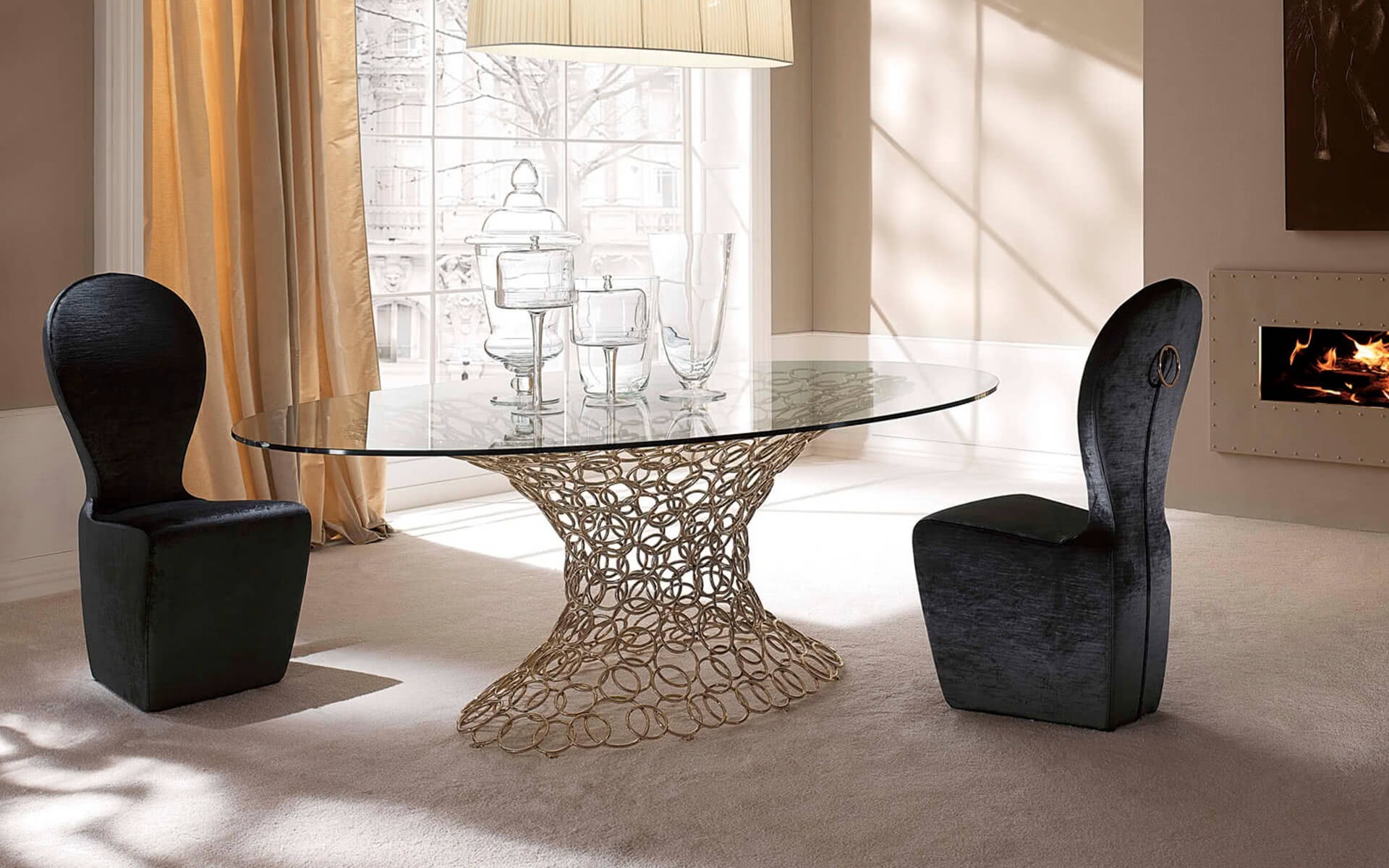
Blue may also be a detail of your living area, as occurs in this proposal always designed by Cantori. The blue chairs create a refined contrast with the rest of the furnishings.
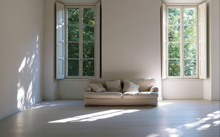
8. If your home's living area coincides with the relaxation area, you may decide to increase the sense of tranquillity by choosing a bleached parquet floor.
9. The classic of classics: playing with brown
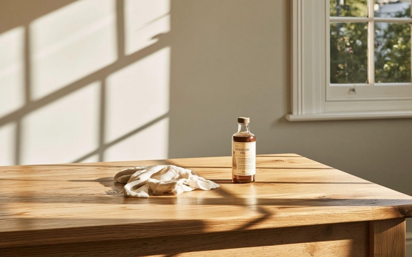
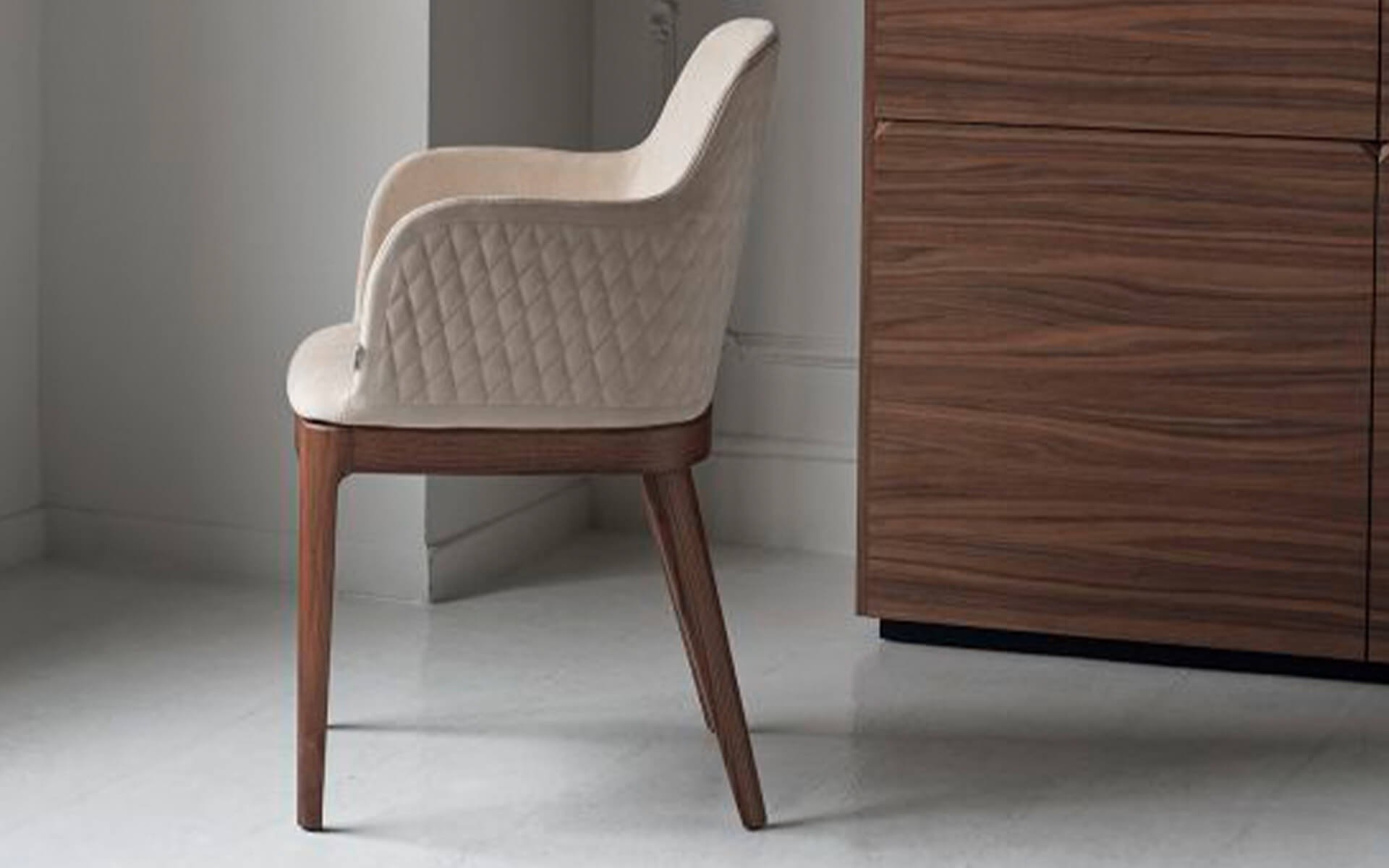
Brown is one of the most popular colours for home decoration, especially when choosing furniture. The cream is undoubtedly the colour that best enhances brown, especially when you have wooden furniture. The cream brings out every grain and emphasises the warm tones, making your environment warm and welcoming.
All this is visible in Bontempi's Margot chair below.
10. Unusual combination: with yellow
Yellow is a touch of light that brightens up beige, and beige is a perfect base for highlighting any shade of yellow, an unusual but winning pair.
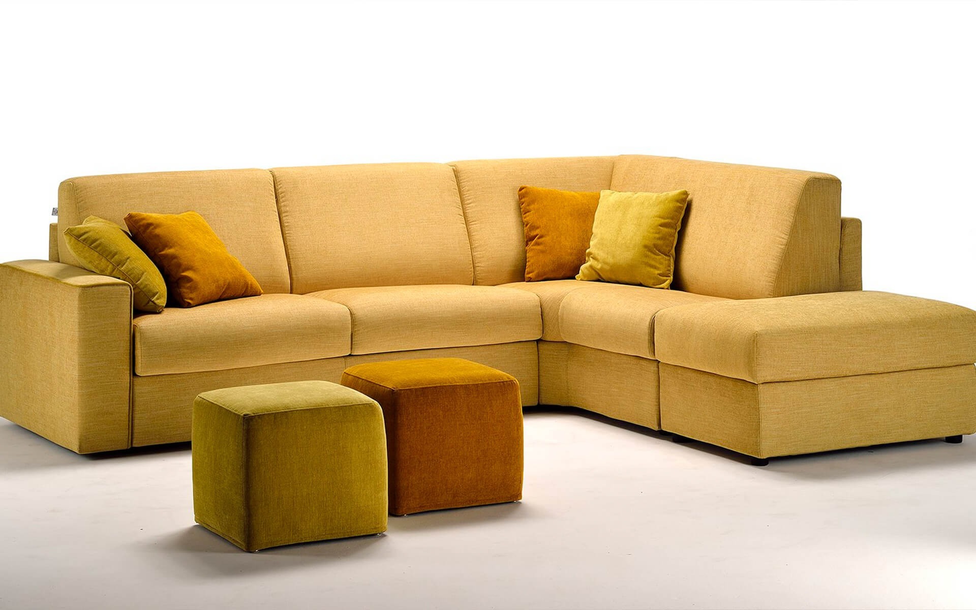
We can already imagine giving your cream-coloured living room a lively touch with this beautiful yellow sofa!
_14077b47db_23.jpg)
Interior Designer since 1985
CEO & Founder, Italian Design in the World